Analytics
AI Studio provides a reporting framework for Chatbot webservice. With this, you can view the statistics of various operations like chat conversations through the chatbot, agent-related reports, etc.
While creating the Cognibot project, select Generate Predefined Reports to create and add the default report definitions, dashboards, and datasource.
Following are the subtabs that are related to analytics.
Datasource
Datasource lists the database connection(s) used in reports to fetch data. The datasource is usually the connection to the Chatbot webservice database. Users can add their own database connections details to show the relevant reports on the dashboard. To create a datasource,
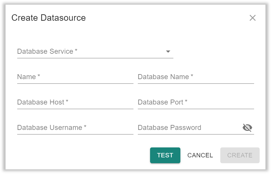
- Click Create Datasource. The below dialog box will be displayed.
-
Enter the details available under the Create Datasource dialog,
- Database Service: Select the database service from the dropdown. It is a type of database we want to connect to. We support PostgreSQL, Oracle, and MSSQL.
- Name: Enter the name for the datasource.
- Host: Enter the host name to connect to the database.
- Port: Enter the database port number.
- Username: Enter the database username. Make sure that this user has the required privileges to read data.
- Password: Enter the database password.
infoDatabase Services ensures that customer databases are protected and monitored by establishing backup and recovery procedures, providing a secure database environment, and monitoring database performance.We can define the port as an endpoint of service for communication purposes. It might bind to a particular application or service.
After entering all the required details, click "Test". Once tested successfully, the user can click "Create". The "Create" button remains disabled until the datasource is tested successfully.
For MSSQL, Authentication Mode also can be provided. Options are,
- Native: If this option is selected, the Username and Password fields are manadatory.
- Windows: For this option, when the connection is established it will use the logged-in windows user credentials.
Reports
Reports are query definitions that fetch the required data from the database. These reports can be added to the dashboard. AI Studio provides a variety of reports, and in addition to that, you can create your own custom reports.
To create a report,
- Click Create Definition. The below dialog box will be displayed.
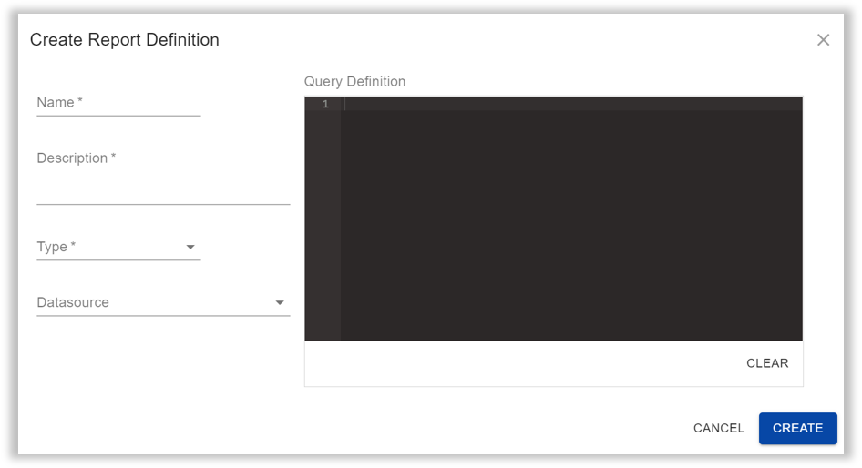
- Enter the details given below in the Create Report Definition dialog,
- Name: Enter the name of the report.
- Description: Enter the description for the report.
- Type: Select the type of report from the dropdown. Options are,
- Time Series: Time series reports are created for queried data based on a column that has timestamps.
- Generic: Generic reports are created using queried data.
- Time Series Trend: These are similar to time series reports, with a maximum time frame of one day.
- Datasource: Enter the database connection to be used.
- Query: Enter the SQL query that gives filtered data for reports.
The report definitions created by AI Studio cannot be modified.
Dashboard
A Dashboard is a collection of reports of various forms which enable the user to understand and analyze the data fetched from the configured datasource. You can create multiple dashboards and add reports to them accordingly.
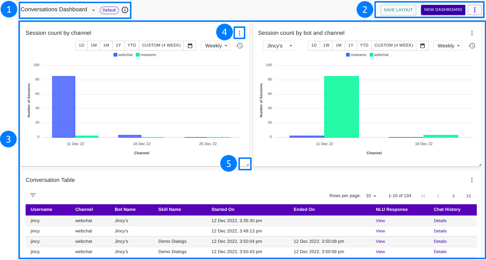
- Select Dashboard: The user can switch between dashboards.
If the selected dashboard is the Default, that is also shown here.
Hover over the information( ) icon to view the Dashboard description.
 - Save Layout: This option is used to save any changes made to the current dashboard.
New Dashboard: Create a new dashboard with this option. Enter the following details in the New Dashboard dialog.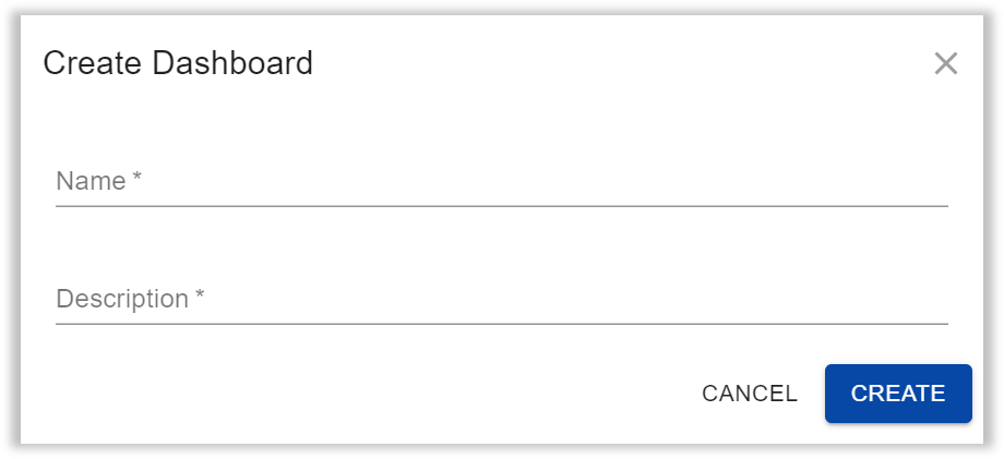
- Name: Enter the name of the dashboard.
- Description: Enter the description for the dashboard.
More options on three dots ( )
)
Edit Dashboard: You can modify the dashboard name and description.
Delete Dashboard: Permanently delete the dashboard and all the reports add to the dashboard.
Mark as Default: Mark the current dashboard as Default. When you click the Dashboard subtab, the default dashboard will be shown.
Add Report: Add a new report to the current dashboard.
- This section contains all the reports that have been added and arranged in the dashboard.
- Each report will have more options on click of three dots ( ),
Configure: The report configuration is updated with this option.
Export: Export the report to CSV or XLSX format file.
Remove: Delete the report from the dashboard. - The reports can be resized from here. You can also drag and drop the report wherever you want on the dashboard.
Some report definitions have verying configurations. Below is a table that summarizes the configurations available for each report definition.
| Report Definition | Configurations Available | Configuration Types | Color Pallete Enabled | Drilldown Available |
|---|---|---|---|---|
| conversation_time_series | Display Duration Axis Data | Chart [only Bar / Line / Area] Table | ✅ | |
| conversation_trends | Display Duration Axis Trend | Chart [only Line / Area] Table | ✅ | |
| nlu_response_time_series | Display Duration Axis Data | Chart [only Bar / Line / Area] Table | ✅ | |
| nlu_intent_wise_report | Display | Chart [all types] Card Table | ||
| chat_session_bot_wise_report | Display Duration Axis Data | Chart [only Bar / Line / Area] Table | ✅ | ✅ |
| chat_session_channel_wise_report | Display Duration Axis Data | Chart [only Bar / Line / Area] Table | ✅ | ✅ |
| chat_session_bot_channel_wise_report | Display Duration Axis Data | Chart [only Bar / Line / Area] Table | ✅ | |
| conversation_report | Display | Chart [all types] Card Table | ✅ | |
| distict_users_per_bucket_time_series | Display Duration Axis Data | Chart [only Bar / Line / Area] Table | ✅ | |
| nlu_response_times_report | Display Axis | Chart [all types] Card Table | ||
| session_duration_trends | Display Duration Axis Data | Chart [all types] Card Table | ✅ | |
| skill_wise_rating | Display Axis | Chart [all types] Card Table | ||
| skill_wise_conversations | Display Axis | Chart [all types] Card Table | ||
| avg_time_spent_on_each_skill | Display Axis | Chart [all types] Card Table | ||
| total_time_spent_skill_agent | Display Axis | Chart [all types] Card Table |
When a new dashboard is created, the user is redirected to the new dashboard by default.
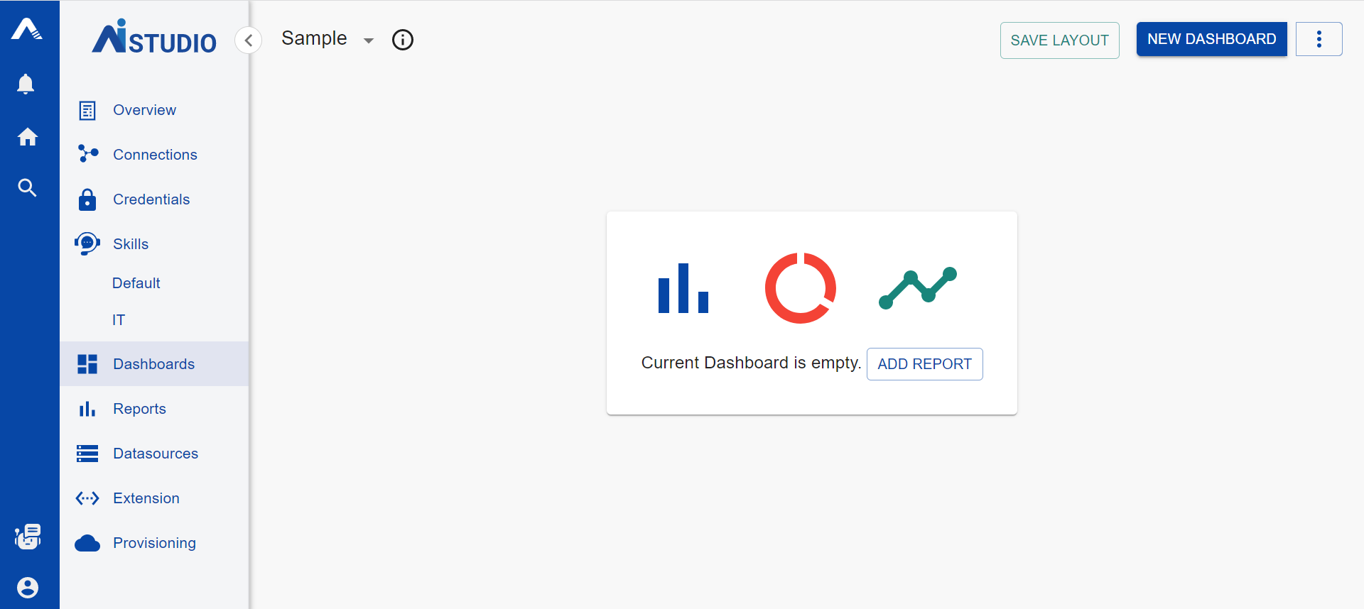 To start adding reports to this new dashboard, the user can click "Add Report" as seen in the middle of the screen. When user clicks on "Add Report", the following dialog is displayed
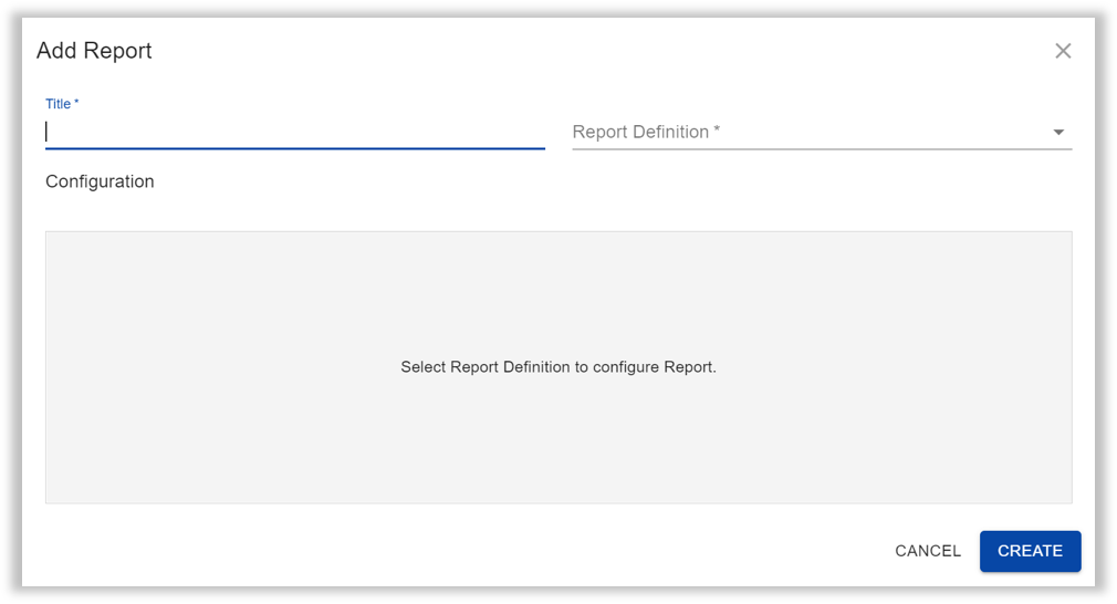 Once the user enters the Name and chooses a Report Definition from the dropdown list, the Configuration box gets enabled as shown below.
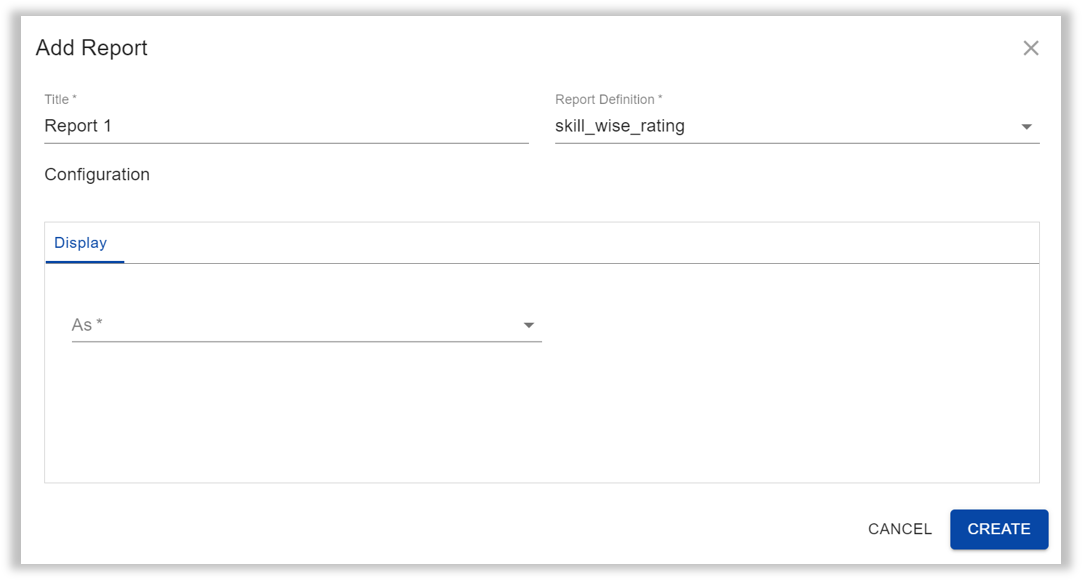 There are three options within Display with the following types in each,
-
Chart
Display Type Description Bar A bar chart is a graph that presents categorical data with rectangular bars with heights or lengths proportional to the values that they represent. Line Line charts are a fundamental chart type generally used to show change in values across time. Area An area chart combines the line chart and bar chart to show how one or more groups’ numeric values change over the progression of a second variable, typically that of time. Bar Horizontal Horizontal bar graphs represent the data horizontally. The data categories are shown on the vertical axis and the data values are shown on the horizontal axis. The length of each bar is equal to the value corresponding the data category and all bars go across from left to right. Pie A pie chart is a pictorial representation of data in the form of a circular chart or pie where the slices of the pie show the size of the data. The user needs to add "Axis" data for Bar, Line, Area, and Bar Horizontal Charts. The axis data consists of the Titles and Columns (from the available dropdown list) for both - X and Y Axes. In case of Pie Charts, the user needs to configure the "Data" tab which consists of Label and Count Columns, each with a corresponding dropdown list.
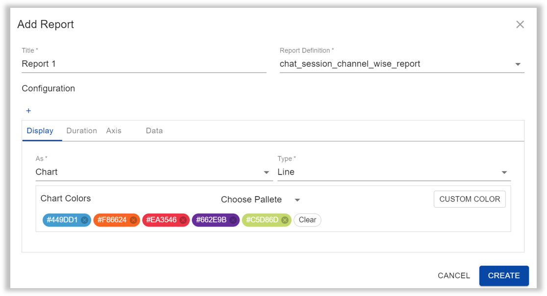
Some provide users the additonal option of configuring the Chart Colors. The user may either choose one of the eight pre-set color palletes or choose custom colours using Hex Codes. Hex codes can be easily obtained on any site having colour information over the internet. Some examples are
- HTML Color Codes
- HTML Color Picker- W3Schools
- Color-Hex
-
Card
Display Type Description Jumbotron A jumbotron indicates a big box for calling extra attention to some special content or information. It also enlarges the font sizes of the text inside it. Rating A rating card displays the ratings along with other basic details available in the report defintion by a specific parameter based on the report definition. The parameter is chosen in the Data tab that appears when the Rating option is chosen. 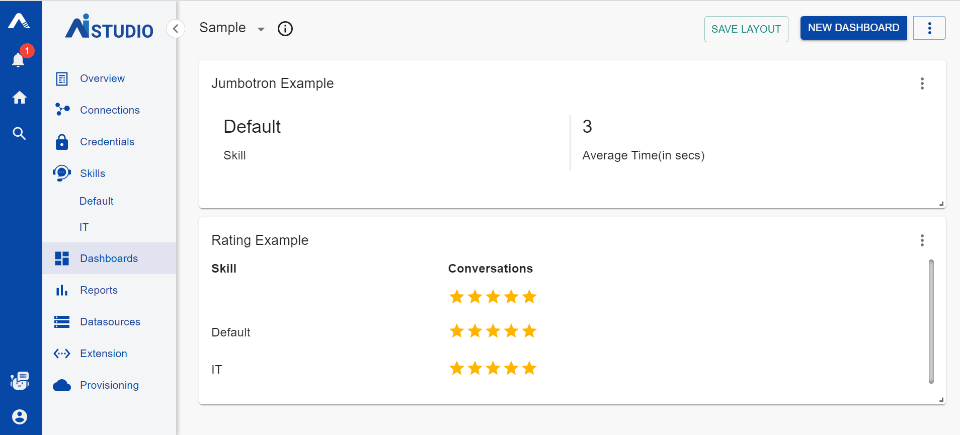
-
Table
This option simply creates a table of all the parameters included in the report defintion. Once a table is created, the user has the option to add filters using the (
 ) icon. The following dialog box appears,
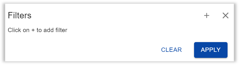 On clicking on the plus icon, the user sees the option to choose a Key from the dropdown list consisting of parameters from the report definition. On choosing a key, the user has to further choose the Operation (Starts with/Ends with/Contains) and a Value for the operation.info
The user can add multiple filters.
Some report definitions also require the user to configure the Duration, Axis, and Data along with the Display. For Duration, the user has to choose the Type (Absolute/Relative), Period Type (Hour/Day/Week/Month/Year) and Period. For Axis, the user has to set the Titles and Columns (from the available dropdown list) for both - X and Y Axes. While in Data, the user can configure what parameter to plot the chart against, a parameter to filter the chart on.
For some report definitions, a plus sign ( ![]() )appears above the configuration tab. Clicking on this, adds a Drilldown to the chart configuration. Drilldown is only enabled for Bar, Line and Area charts. The drilldown can be deleted by clicking on the (
)appears above the configuration tab. Clicking on this, adds a Drilldown to the chart configuration. Drilldown is only enabled for Bar, Line and Area charts. The drilldown can be deleted by clicking on the ( ![]() ) icon in the right corner of the configuration box.
) icon in the right corner of the configuration box.
Click to understand what drilldowns are!
Drilling down gives the user a way to reveal additional levels of detail within a chart. Adding drill-down charts to your reports can make them more interactive, reduce the number of separate charts required, and make it easier to find insights at various levels of detail in the data.
For example, suppose you want to report on sessions by country, and sessions by city. Rather than include two charts in your report, you can include a single chart with drill-down enabled. When drill-down is enabled on a chart, you can drill down from a higher level of detail to a lower one (e.g., from Country to City).
All reports have the three dots icon ( ![]() ) in the top-right corner. Within this, the user has the following options
) in the top-right corner. Within this, the user has the following options
- Configure: This helps the user to edit the set configuration for the report.
- Export: This lets the user export the report as a CSV or XLSX file.
- Remove: This deletes the report from the dashboard.
Every report can be resized by clicking on the resize icon ( ![]() ) in the bottom right corner of the report. The report can be resized by dragging it across the screen to make it as big or as small as the user wants.
) in the bottom right corner of the report. The report can be resized by dragging it across the screen to make it as big or as small as the user wants.