Webpage
As was mentioned in the Installation section, you deploy two directories namely aistudio and webchat inside public folder of NGINX. One hosts AI Studio web UI and other is a simple and sample website which demonstrates how you can embed webchat on any webpage. Assuming you have followed installation instructions, you can access the webchat by pointing your browser to http://localhost:8008/webchat. webchat folder is a bunch of HTML, CSS and JavaScript files and can be deployed on any web server. As we saw in the Architecture section, webchat, like any other chat channels, needs to talk to connector service which in turn is going to talk to chatbot web service. This is how this page looks like.
If you click on the icon on the bottom right, you will see a welcome screen and when you click on "Get Started" button, you will see the actual webchat window. In turn this results in showing the <div id="chat-window"> which in turn contains an iframe. Images in the below table show these two screens.
| Welcome Screen | Webchat window |
|---|---|
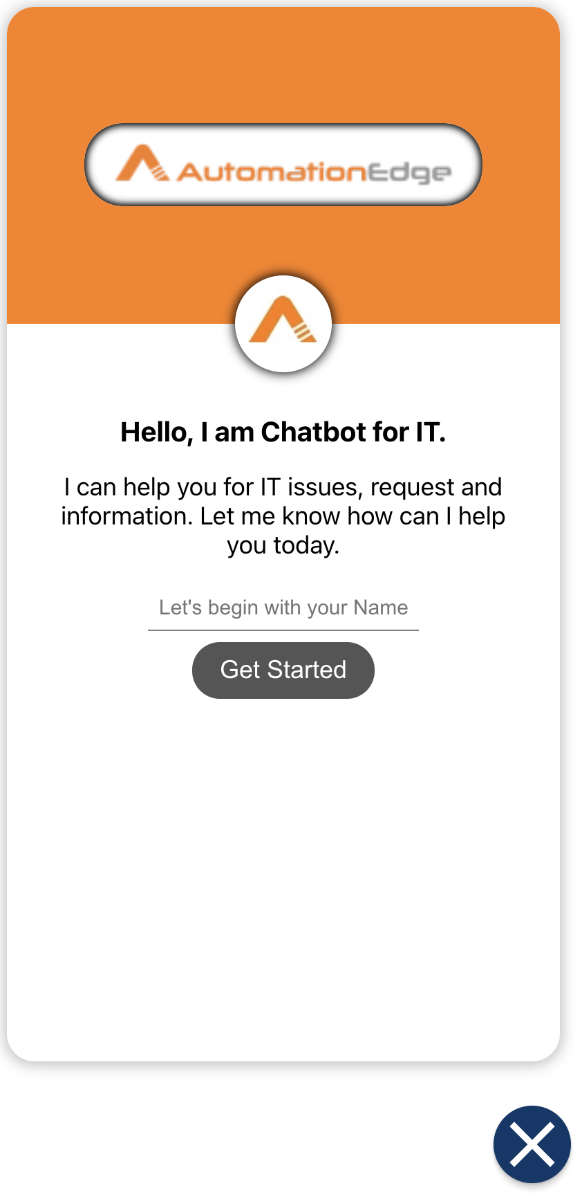 | 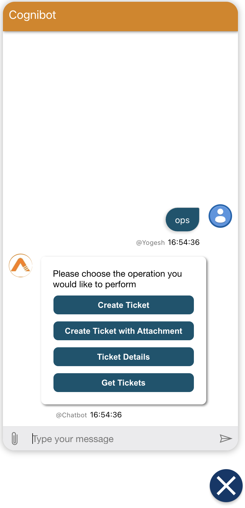 |
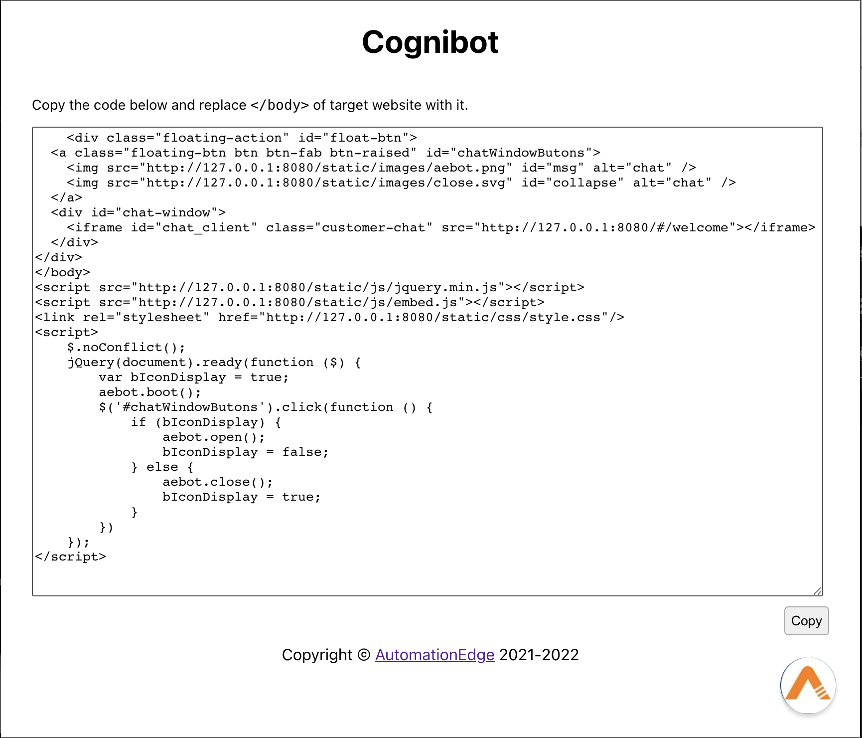
This just shows one way to incorporate webchat on a webpage. Let's say you have an existing webpage and you want to embed webchat on it. HTML below shows how it can be done. This will end up putting icon to bring up the chat window on the webpage at the bottom right corner.
<!DOCTYPE html>
<html lang="en">
  <head>
    <meta charset="UTF-8" />
    <meta http-equiv="X-UA-Compatible" content="IE=edge" />
    <meta name="viewport" content="width=device-width, initial-scale=1.0" />
    <title>Sample Page</title>
  </head>

  <body>
    <!-- Your webpage code  -->

    <!-- ================================================== -->
    <!-- </body> Comment/Remove this closing body tag       -->
    <div class="floating-action" id="float-btn">
      <a class="floating-btn btn btn-fab btn-raised" id="chatWindowButons">
        <img
          src="http://localhost:8008/webchat/static/images/aebot.png"
          id="msg"
          alt="chat"
        />
        <img
          src="http://localhost:8008/webchat/static/images/close.svg"
          id="collapse"
          alt="chat"
        />
      </a>
      <div id="chat-window">
        <iframe
          id="chat_client"
          class="customer-chat"
          src="http://localhost:8008/webchat/#/welcome"
        ></iframe>
      </div>
    </div>
  </body>
  <script src="http://localhost:8008/webchat/static/js/jquery.min.js"></script>
  <script src="http://localhost:8008/webchat/static/js/embed.js"></script>
  <link
    rel="stylesheet"
    href="http://localhost:8008/webchat/static/css/style.css"
  />
  <script>
    $.noConflict();
    jQuery(document).ready(function ($) {
      var bIconDisplay = true;
      aebot.boot();
      $("#chatWindowButons").click(function () {
        if (bIconDisplay) {
          aebot.open();
          bIconDisplay = false;
        } else {
          aebot.close();
          bIconDisplay = true;
        }
      });
    });
  </script>
  <!-- ================================================== -->
</html>
Configuration
You can customize chatbot name, connector service connection details, icon, company logo, images, CSS etc. You pretty much get following three HTML pages with webchat.
- Initial page can be accessed at
/webchat/#/ - Welcome page at
/webchat/#/welcomeand - Webchat page at
/webchat/#/chat
Configurable items can be changed through static/js/config.json file.
Connector service details
Connector service details are part of connection section.
  "connection": {
    "token": "secret",
    "domain": "http://localhost:3978/v3/directline"
  }
Initial page
On the initial page you can configure,
- botName - visible on the top; default value - Cognibot
- botImage - Bot image to be used on embedded chatbot button. Add new image in
static/imagesand used relative path in configuration - landingPage - You can specify either
welcomeorchathere. For the latter, welcome page will not be shown and you will directly be shown the webchat page.
  "embedPage": {
    "botName": "Cognibot",
    "botImage": "static/images/aebot.png",
    "landingPage": "/welcome"
  }
Welcome page
On welcome page you can configure,
- coverLogoImage - visible on the top
- BotImage - Bot image shown in circle
- title, subtitle, summary - To show chatbot information and static welcome message
- inputTextPlaceholder, buttonText - as the name suggest for respective operations
  "welcomePage": {
    "coverLogoImage": "static/images/aelogo.png",
    "botImage": "static/images/aebot.png",
    "title": "Hello, I am Chatbot for IT.",
    "subtitle": "",
    "summary": "I can help you for IT issues, request and information. Let me know how can I help you today.",
    "inputTextPlaceholder": "Let's begin with your Name?",
    "buttonText": "Get Started"
  }
Webchat page
On Webchat page you can configure,
- title - Chatbot name; default value - Cognibot
- webchatStyle - Customise webchat styling with this json
  "chatPage": {
    "title": "Cognibot",
    "webchatStyle": {
      // Avatar
      "botAvatarImage": "static/images/aebot.png",
      "botAvatarInitials": "",
      "userAvatarInitials": "",
      "backgroundColor": "#fff",
      "botAvatarBackgroundColor": "#da8300",
      "userAvatarImage": "static/images/userAvatar.png",
      // Bubble
      "bubbleBorderWidth": 0,
      "bubbleFromUserBorderWidth": 0,
      "bubbleBorderRadius": 1,
      "bubbleFromUserBorderRadius": 0,
      "bubbleBackground": "transparent",
      "bubbleFromUserBackground": "transparent",
      // Transcript overlay buttons
      "transcriptOverlayButtonBackground": "rgba(94, 110, 234, .6)",
      "transcriptOverlayButtonBackgroundOnFocus": "rgba(94, 110, 234, .8)",
      "transcriptOverlayButtonBackgroundOnHover": "rgba(94, 110, 234, .8)",
      "transcriptOverlayButtonColor": "White",
      // Suggested actions
      "suggestedActionBackground": "#bba27d",
      "suggestedActionBorderColor": "#000",
      "suggestedActionBorderStyle": "solid",
      "suggestedActionBorderWidth": 2,
      "suggestedActionBorderRadius": "50px",
      "suggestedActionImageHeight": 20,
      "suggestedActionTextColor": "White",
      "suggestedActionDisabledBorder": null,
      "suggestedActionDisabledBorderColor": "#E6E6E6",
      "suggestedActionDisabledBorderStyle": "solid",
      "suggestedActionDisabledBorderWidth": 2,
      "suggestedActionHeight": 38,
      // Send box
      "sendBoxBackground": "#ebebed"
    }
  }
webchatStyle mentioned above contain values used for webchat packaged with AI Studio distribution. You can access it in aistudio/ui/html/static/js/config.json. You can extend this configuration using properties defined in next section.
Styling options
Put following key with appropriate value. Description, Default value is given for each key value pair.
/**
   * Basic styling
   */

  /** Web Chat component accent color - [default - '#0063B1'] */
  accent?: string;

  /**
   * Transcript background color - [default - 'White']
   */
  backgroundColor?: string;

  /**
   * Secondary component color - [default - '#767676']
   */
  subtle?: string;

  /**
   * Default padding used in most visual components - [default - 10]
   */
  paddingRegular?: number;

  /**
   * Padding used for suggestedAction buttons - [default - 20]
   */
  paddingWide?: number;

  /**
  Transition for Bubble, Carousel, and StackedLayout - [default - '0s']
   */
  transitionDuration?: string;

  /**
   * Fonts
   * Default font size will be inherited from the host app
   */

  /**
   * Font size used for secondary components such as sendStatus - [default - '80%']
   */
  fontSizeSmall?: number | string;

  /**
   * Font used for ErrorBox
   * comma-space separated string - [default - 'Consolas', 'Courier New', 'monospace']
   */
  monospaceFont?: string;

  /**
   * Font used in most visual components
   * comma-space separated string - [default - 'Calibri', 'Helvetica Neue', 'Arial', 'sans-serif']
   */
  primaryFont?: string;

  // [default - '100%']
  rootHeight?: number | string;

  // [default - '100%']
  rootWidth?: number | string;

  /**
   * "z-index" for the root container of Web Chat. This will form a new stacking context so "z-index" used in children won't pollute. [default - 0]
   */
  rootZIndex?: number;

  /**
   * Avatar styling
   */

  /**
   * Border radius used for both bot and user avatar - [default - '50%']
   */
  avatarBorderRadius?: number | string;

  /**
   * Height and width of avatar - [default - '50%']
   */
  avatarSize?: number;

  /**
   * Background color defaults to accent
   */
  botAvatarBackgroundColor?: string;

  /**
   * URL string. Can be data URI or blob
   * botAvatarInitials must be set to empty string
   */
  botAvatarImage?: string;

  /**
   * Typically rendered as two letters, e.g. 'WC'
   * Empty string is required when setting botAvatarImage
   */
  botAvatarInitials?: string;

  /**
   * Background color defaults to accent
   */
  userAvatarBackgroundColor?: string;

  /**
   * URL string. Can be data URI or blob
   * userAvatarInitials must be set to empty string
   */
  userAvatarImage?: string;

  /**
   * Typically rendered as two letters, i.e. 'WC'
   * Empty string is required when setting userAvatarImage
   */
  userAvatarInitials?: string;

  /**
   * Avatar grouping can be set at 3 different levels:
   * Show avatar on activities sharing the same sender ('sender')
   * Show avatar on activities sharing the same status ('status'; default)
   * Show avatar on every activity (true)
   */
  showAvatarInGroup?: true | 'sender' | 'status';

  /**
   *  Bubble styling
   * 'Bubble' refers to the container of the activit(ies) from the bot and user. Below, non-'fromUser' props refer to styling for the bot activities.
   */

  bubbleBackground?: string;
  bubbleBorderColor?: string;
  bubbleBorderRadius?: number;
  bubbleBorderStyle?: string;
  bubbleBorderWidth?: number;
  bubbleFromUserBackground?: string;
  bubbleFromUserBorderColor?: string;
  bubbleFromUserBorderRadius?: number;
  bubbleFromUserBorderStyle?: string;
  bubbleFromUserBorderWidth?: number;

  /**
   * Nub offset 'bottom' will render nub at the bottom
   * A positive or negative number will shift nub offset up/down
   * "top" is equivalent to positive zero.
   * "bottom" is equivalent to negative zero.
   */
  bubbleFromUserNubOffset?: number | 'bottom' | 'top';

  /**
   * Nub size 0 will render a sharp corner
   */
  bubbleFromUserNubSize?: number;

  bubbleFromUserTextColor?: string;
  bubbleImageHeight?: number;
  bubbleMaxWidth?: number;
  bubbleMinHeight?: number;
  bubbleMinWidth?: number;

  /**
   * Nub offset ''bottom' will render nub at the bottom
   * A positive or negative number will shift nub offset up/down
   * "top" is equivalent to positive zero.
   * "bottom" is equivalent to negative zero.
   */
  bubbleNubOffset?: number | 'bottom' | 'top';

  /**
   * Nub size 0 will render a sharp corner
   */
  bubbleNubSize?: number;

  bubbleTextColor?: string;

  messageActivityWordBreak?: 'normal' | 'break-all' | 'break-word' | 'keep-all';

  /**
   * Connectivity UI styling
   */

  connectivityIconPadding?: number;
  connectivityMarginLeftRight?: number;
  connectivityMarginTopBottom?: number;
  connectivityTextSize?: number | string;
  failedConnectivity?: number | string;
  slowConnectivity?: string;
  notificationText?: string;

  /**
   * Slow connection status will render after x amount of time with no service response
   */
  slowConnectionAfter?: number;

  /**
   * Emoji styling
   * If true, Web Chat's default set of emoji will be enabled. See patchStyleOptions.js for default list.
   * A custom object will enable unicode emoji specified by the developer.
   * key: emoticon
   * value: unicode emoji
   */
  emojiSet?: boolean | Record<string, string>;

  /**
   * Live region - Accessibility
   * New activities will be rendered in the non-visual live region and removed after a certain amount of time. Modify this property to change fade time.
   */
  internalLiveRegionFadeAfter?: number;

  /**
   * Markdown styling
   * Parse markdown to ensure carriage return is respected
   */
  markdownRespectCRLF?: boolean;

  /**
   * Assign new image for anchor links to indicate external
   */

  markdownExternalLinkIconImage?: string;
  /**
   * Scroll behavior styling
   */

  /**
   * Prevent scroll to end button from rendering
   */
  hideScrollToEndButton?: boolean;

  /**
   * Snap to activity to 'snap-point'
   * If true, scrolling will pause after 1 activity is received.
   * Specifying a number will pause after X number of activities
   */
  autoScrollSnapOnActivity?: boolean | number;

  /**
   * Specify number of pixels to overscroll or underscroll after pause
   */
  autoScrollSnapOnActivityOffset?: number;

  /**
   * If true, scrolling will pause after activities have filled the page.
   * Specifying a number (0 to 1) will pause after % of page is filled
   */
  autoScrollSnapOnPage?: boolean | number;

  /**
   * Specify number of pixels to overscroll or underscroll after pause
   */
  autoScrollSnapOnPageoffset?: number;

  /**
   * Send box styling
   [default -
   hideSendBox: false,
   hideUploadButton: false,
   microphoneButtonColorOnDictate: '#F33',
   sendBoxBackground: 'White',
   sendBoxButtonColorOnDisabled: '#CCC',
   sendBoxButtonColorOnFocus: '#333',
   sendBoxButtonColorOnHover: '#333',
   sendBoxDisabledTextColor: undefined,
   sendBoxHeight: 40,
   sendBoxMaxHeight: 200,
   sendBoxTextColor: 'Black',
   sendBoxBorderTop: 'solid 1px #E6E6E6',
   sendBoxTextWrap: false,
   sendBoxButtonAlignment: 'stretch',]
   */

  hideSendBox?: boolean;
  hideUploadButton?: boolean;
  microphoneButtonColorOnDictate?: string;
  sendBoxBackground?: string;

  /**
   * Button color defaults to subtle
   */
  sendBoxButtonColor?: string;

  sendBoxButtonColorOnDisabled?: string;
  sendBoxButtonColorOnFocus?: string;
  sendBoxButtonColorOnHover?: string;

  /**
   * Disabled text color defaults to subtle
   */
  sendBoxDisabledTextColor?: string;

  sendBoxHeight?: number | string;
  sendBoxMaxHeight?: number | string;
  sendBoxTextColor?: string;
  sendBoxBorderBottom?: number | string;
  sendBoxBorderLeft?: number | string;
  sendBoxBorderRight?: number | string;
  sendBoxBorderTop?: number | string;
  sendBoxPlaceholderColor?: string;
  sendBoxTextWrap?: boolean;
  sendBoxButtonAlignment?: 'bottom' | 'stretch' | 'top';

  /**
   * Show spoken text
   */
  showSpokenText?: boolean;

  /**
   * Spinner animation styling
   */

  spinnerAnimationBackgroundImage?: string;
  spinnerAnimationHeight?: number | string;
  spinnerAnimationWidth?: number | string;
  spinnerAnimationPadding?: number | string;

  /**
   * Suggested Actions
   */

  suggestedActionBackground?: string;

  /**
   * Border color defaults to accent.
   */
  suggestedActionBorderColor?: string;

  suggestedActionBorderRadius?: number | string;
  suggestedActionBorderStyle?: string;
  suggestedActionBorderWidth?: number | string;

  /**
   * Disabled background defaults to suggestedActionBackground
   */
  suggestedActionDisabledBackground?: string;

  suggestedActionDisabledBorderColor?: string;
  suggestedActionDisabledBorderStyle?: string;
  suggestedActionDisabledBorderWidth?: number | string;

  /**
   * Disabled text color defaults to subtle
   */
  suggestedActionDisabledTextColor?: string;

  suggestedActionHeight?: number | string;
  suggestedActionImageHeight?: number | string;
  suggestedActionLayout?: 'carousel' | 'flow' | 'stacked';
  suggestedActionTextColor?: string;

  /**
   * Suggested actions carousel layout
   */

  /**
   * Cursor when mouseover on flipper
   */
  suggestedActionsCarouselFlipperCursor?: string;

  /**
   * Flipper bounding box size
   */
  suggestedActionsCarouselFlipperBoxWidth?: number;

  /**
   * Flipper button's visible size
   */
  suggestedActionsCarouselFlipperSize?: number;

  /**
   * Suggested actions flow layout
   * Default value is 'auto',
   */
  suggestedActionsFlowMaxHeight?: undefined;

  /**
   * Suggested actions stacked layout
   */

  /**
   * Stacked height container's max height. Default value is 'auto'
   */
  suggestedActionsStackedHeight?: number | 'auto';

  /**
   * Stacked overflow default value is 'auto
   */
  suggestedActionsStackedOverflow?: 'string';

  /**
   * Button max height default value is 100% if suggestedActionsStackedLayoutButtonTextWrap is true
   */
  suggestedActionsStackedLayoutButtonMaxHeight?: number | string;

  /**
   * Button Text Wrap, if set to true, will wrap long text in buttons in STACKED mode ONLY
   */
  suggestedActionsStackedLayoutButtonTextWrap?: boolean;

  /**
   * Timestamp
   [default -
   groupTimestamp: true,
   sendTimeout: 20000,
   sendTimeoutForAttachments: 120000]
   */

  groupTimestamp?: boolean;
  sendTimeout?: number;
  sendTimeoutForAttachments?: number;

  /**
   * Timestamp color default value is subtle
   */
  timestampColor?: string;

  timestampFormat?: 'absolute' | 'relative';

  /**
   * Transcript styling
   */

  transcriptTerminatorBackgroundColor?: string;
  transcriptTerminatorBorderRadius?: number | string;
  transcriptTerminatorColor?: string;
  transcriptTerminatorFontSize?: number | string;

  transcriptActivityVisualKeyboardIndicatorColor?: string;
  transcriptActivityVisualKeyboardIndicatorStyle?: string;
  transcriptActivityVisualKeyboardIndicatorWidth?: number | string;

  transcriptVisualKeyboardIndicatorColor?: string;
  transcriptVisualKeyboardIndicatorStyle?: string;
  transcriptVisualKeyboardIndicatorWidth?: number | string;

  /**
   * Transcript overlay button
   * e.g. carousel and suggested action flippers, scroll to bottom, etc.
   [default -
   newMessagesButtonFontSize: '85%',
   transcriptOverlayButtonBackground: 'rgba(0, 0, 0, .6)',
   transcriptOverlayButtonBackgroundOnDisabled: 'rgba(0, 0, 0, .6)',
   transcriptOverlayButtonBackgroundOnFocus: 'rgba(0, 0, 0, .8)',
   transcriptOverlayButtonBackgroundOnHover: 'rgba(0, 0, 0, .8)',
   transcriptOverlayButtonColor: 'White',
   transcriptOverlayButtonColorOnDisabled: 'White',]
   */

  newMessagesButtonFontSize?: number | string;
  transcriptOverlayButtonBackground?: string;
  transcriptOverlayButtonBackgroundOnDisabled?: string;
  transcriptOverlayButtonBackgroundOnFocus?: string;
  transcriptOverlayButtonBackgroundOnHover?: string;
  transcriptOverlayButtonColor?: string;
  transcriptOverlayButtonColorOnDisabled?: string;

  /**
   * Default value is transcriptOverlayButtonColor
   */
  transcriptOverlayButtonColorOnFocus?: string;

  /**
   * Default value is transcriptOverlayButtonColor
   */
  transcriptOverlayButtonColorOnHover?: string;

  /**
   * Toast UI
   */

  /**
   * New debounce timeout value only affects new notifications.
   [default -

   notificationDebounceTimeout: 400,

   hideToaster: false,
   toasterHeight: 32,
   toasterMaxHeight: 32 * 5,
   toasterSingularMaxHeight: 50,
   toastFontSize: '87.5%',
   toastIconWidth: 36,
   toastSeparatorColor: '#E8EAEC',
   toastTextPadding: 6,

   toastErrorBackgroundColor: '#FDE7E9',
   toastErrorColor: '#A80000',
   toastInfoBackgroundColor: '#CEF1FF',
   toastInfoColor: '#105E7D',
   toastSuccessBackgroundColor: '#DFF6DD',
   toastSuccessColor: '#107C10',
   toastWarnBackgroundColor: '#FFF4CE',
   toastWarnColor: '#3B3A39']
   */
  notificationDebounceTimeout?: number;

  hideToaster?: boolean;
  toasterHeight?: number | string;
  toasterMaxHeight?: number | string;
  toasterSingularMaxHeight?: number | string;
  toastFontSize?: number | string;
  toastIconWidth?: number | string;
  toastSeparatorColor?: string;
  toastTextPadding?: number | string;

  toastErrorBackgroundColor?: string;
  toastErrorColor?: string;
  toastInfoBackgroundColor?: string;
  toastInfoColor?: string;
  toastSuccessBackgroundColor?: string;
  toastSuccessColor?: string;
  toastWarnBackgroundColor?: string;
  toastWarnColor?: string;

  /**
   * Typing animation
   [default -
   typingAnimationDuration: 5000,
   typingAnimationHeight: 20,
   typingAnimationWidth: 64]
   */

  typingAnimationBackgroundImage?: string;
  typingAnimationDuration?: number;
  typingAnimationHeight?: number | string;
  typingAnimationWidth?: number | string;

  /**
   * Upload thumbnail
    [default -
    enableUploadThumbnail: true,
    uploadThumbnailContentType: 'image/jpeg',
    uploadThumbnailHeight: 360,
    uploadThumbnailQuality: 0.6,
    uploadThumbnailWidth: 720 ]
   */

  enableUploadThumbnail?: boolean;
  uploadThumbnailContentType?: string;
  uploadThumbnailHeight?: number | string;
  uploadThumbnailQuality?: number;
  uploadThumbnailWidth?: number | string;

  /**
   * Video - [default - 270]
   */

  videoHeight?: number | string;